30.9.10

back to the beach


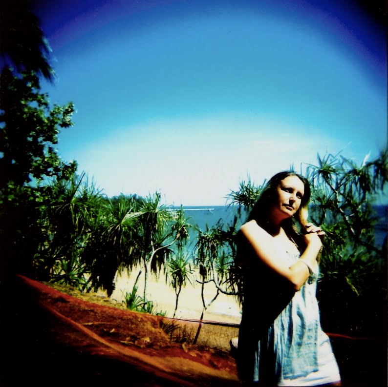
When I went to Splendour in the Grass in 2009, I was lucky enough to be staying right by the beach, and I took some incredibly vibrant colour (slide) photos while I was there that captured the beautiful blues and yellows of the sunny Australian shore. Though this year I camped on-site at the festival, I did manage to glimpse the Queensland ocean when we took a seaside detour on the way to Brisbane airport.

Whenever I am at a beach - and especially in sunny conditions - I am always tempted to take photos. I think there's something about the colours of the landscape that inspire many people to capture beach scenes, and they often do so beautifully. In spite (or because) of this, I made the decision to capture this particular stretch of sand using black and white film.


I didn't expect to like the results - I mean, my past beach photos have been successful largely because of the colour. I anticipated a mass of indistinguishable greys, completely uninteresting to the eye. And in one sense, that's what I got; these images don't have much definition at all, in terms of colour or shape. And they're not even level! However, there is definitely an element of charm to them. With the faded shades, the poor focus and the powerfully obvious vignetting, these photos are strongly reminiscent of some lost era - the days before people took colour photos, and camera technology was in its infancy. I know plastic camera photography often has this effect, but I don't believe any of my other photos have ever evoked it so strongly. Why? Because to shoot the beach devoid of colour seems like a waste. Like something one would only do if colour wasn't widely available - say, in the 1920s. Ridiculous? Yes. But it's the only way I can explain the impression these images leave on me. Will I shoot the beach in black and white again? Maybe. But I don't know that I will be able to once more resist capturing those beautiful colours...

21.9.10

black and white beauties


Is there anything more beautiful than a gorgeous girl on black and white film? Not only is it classic, it also has the very welcome ability to remove flaws - or at least turn them into something lovely in and of themselves. I've recently come across a great film that, with its ultra-smooth definition and high contrast, is the perfect accompaniment to a breathtaking femme fatale.

(I recommend you click through on the images to really see the excellent detail in the film.)

With her tiny frame, platinum hair and enormous eyes, Jessica just cries out to be captured. And I don't think it's the first time she's been randomly photographed - when I asked if I could take her picture she was very open to being in front of the lens. If only every subject was as comfortable with the way they looked; even if she is very aware of being photographed, her fearlessness translates into a gorgeous image. Now, you may be thinking Well no wonder she's comfortable - she's stunning! And you'd be right in that she is undoubtedly very beautiful. But her beauty is nothing if not unconventional, and I really believe that the most attractive people, whether on the street or on film, truly embrace the way they look, even (or especially) if it doesn't fit conventional standards.


Imogen: another wildly attractive lady with unique features. Here she is at a party, and after a few drinks her exhibitionist tendencies have overcome her usual (unwarranted) self-consciousness. I think this is a great shot of Imogen, but knowing how disapproving she can be of herself, I wasn't sure she would agree with me - it's certainly not a typical glamour shot and her eccentricities are on full display. When I showed it to her, though, she loved it! And I suspect it is because she looks so totally confident here. More proof that regardless of anything else, you look your best when you feel great.


Melissa has a dignified modesty about her that ensures she never gratuitously flaunts her beauty. She is also one of the most consistently stylish people I know. I mean, she always looks great. Perhaps this explains why Melissa also always seems quietly self-assured. I look at this photo, and I think her expression communicates that very strongly - she is justifiably calm and confident in front of the camera, but without a trace of arrogance. She is just so elegant.


Bronwyn is the kind of ecstatically enthusiastic person that immediately puts others at ease. Always at the ready with kind words and a heart-warming smile, her outwardly sunny disposition infects everyone around her. I realise this is almost a stereotype, like the introductory voice-over of a bad romance movie, but trust me, in the case of Bronwyn it's true. Well actually, you don't need to trust me - just look at that photo and tell me I'm wrong.

Each of these four images reinforce my impressions of their respective subjects. Are they accurate? Maybe. But it doesn't really matter. They're successful images precisely because they capture what I believe to be true qualities of these magnificent beauties. And, of course, because of that flawless black and white film.

14.9.10

twisted sister


I've always been fond of incorporating multiple exposures into my portraits, usually at night, usually using a coloured flash and usually layering a nondescript pattern over the subject. With these characteristics in mind, this image takes my multiple exposure portraiture in a completely new direction: daytime, natural light, landscape layered over the subject.

I didn't expect that it would work at all as I had rarely attempted this kind of photo before, but it immediately captured my attention because of its extraordinarily unique attributes. The grain, which I have written about before, adds a sense of nostalgia to the image as it reminds me of some of the photos you see from the 70s or 80s. The mise en scene (can I use that term in relation to photographs? Probably not) reinforces this impression, as there is nothing particularly modern in the frame. (Well, maybe the piercing?) Technically it's quite a success, as the portrait itself takes the majority of the film while the landscape only comes in just enough to be visible without ruining the main image. Plus the composition is nice - she's looking slightly off to the left and her hair is in sync with that movement.


Perhaps this one isn't so successful, but it's still very interesting to me - though I can't figure out why. Possibly because it's such a new kind of image for me, and I'm fascinated by the colour and grain - mediocre by today's standards - in a similar way that the portrait on the Sydney Harbour fascinated me. (In fact, they're very similar.) Maybe these images appeal to me precisely because it would be extremely difficult to replicate the effect digitally. Between the slightly off colour, the severe grain and the layered exposure, it is unquestionably created using film. And as ridiculous as it may sound, that just seems a lot more real to me.

5.9.10

the first day of spring


Here we are, back to the Melbourne of old - where the city's weather lives up to its reputation for being inconsistent, unpredictable and often rainy. For the past several years our winters have been alarmingly dry and umbrella ownership has probably dropped significantly, but this year's winter has been suitably wet and cold and miserable. And so it was no surprise that Melbourne welcomed spring with a dreary, grey and relentlessly wet Wednesday.

Eager to finish my film in time to drop it off before closing time, I took out the F4 for the walk between Flinders Street Station and Lonsdale Street in order to reach that often difficult exposure number, 36. (I have done this before on a different route, remember?) I also felt it would be good to test this particular film - a very high speed black and white - in (semi-)daylight because the previous shots on the roll were all taken after dark. The result was pleasantly surprising, as I think the obvious grain really suits that wonderful melancholia that a wet, cold city can evoke.


I also thought I'd try a couple of double exposures, basically because I don't do enough of them. The reason for this is that the nature of multiple exposures means leaving a lot of the outcome to chance, and I find it difficult to surrender that control - but it's a good exercise because more often than not the results are, at the very least, interesting. This image fascinates me - not because it's a perfect shot in any way, but because it shows a lot of potential for multiple exposure in black and white, and in the city. The juxtaposition of the old building with the modern shop signs is quite a good one, and the glow of the lights on this particular film is lovely.

I'll definitely be using this film in the city again. But as the weather inevitably warms up with the changing seasons, I guess the question is - will a less miserable city yield such promising results? And I suspect the answer is, of course. Because while Melbourne might be renowned for perennial teardrops falling from an endlessly grey sky, we know there's a lot more to her than that.

1.9.10

the older they get, the cuter they ain't


So says Marge Simpson's beauty-challenged sister Selma - and in the case of she and chain-smoking, DMV-desk-dwelling twin Patty, it's probably true. But as if to challenge the Bouviers and prove that some sisters retain their splendour long after childhood, the lovely Surace girls recently provided my lens with one of the most fabulous portraits I've taken in quite some time.

These country-bred beauties have been dear friends of mine from the time we were small enough to potentially drown in the large cow pats on their family farm. Of course this alone makes the picture special, but it also impresses me because it reveals some strikingly accurate personality traits: Dallas, the fun-loving extrovert whose outrageous humour and powerful vocal chords cause as much glee for her cohorts as irritation for her seniors, but which also make her irresistible to all but the stoniest of souls; and Bree, whose kindness and overwhelming congeniality - present in her gorgeously honest smile - enchant all whom she encounters. I think this perfectly captures a wonderful moment shared between sisters - two people who know each other intimately enough to put one another completely at ease, even with a camera present. Beyond the personal aspects of the image, the shockingly white hair (they were both wearing wigs) against the flawless skin and midnight background makes for a stunning spectacle.


The photo was taken at a wig party, and was intended to be the first in a series of wig portraits taken over the course of the evening. What a great concept - all of these completely normal guests with outrageous wigs on! In the black and white I thought it would be especially effective, letting the bizarre shapes speak for themselves. However, I only got two taken before everyone removed their wigs in a fit of itchiness. The second one really doesn't stand alone as a good portrait, particularly when compared to the success of the first one, but I think it would have worked had it belonged to an extensive series of portraits as planned. Alone, it seems unspectacular because it lacks animation, and it doesn't appear to capture any particularly vital moment.

Or maybe it's just because they're not sisters.

27.8.10

the cricketer


Kids are prone to obsession. A generalisation, I know, but the combined knowledge from my own childhood, later years of babysitting and the new generation coming through the extended family tells me that youth is consistently marked by passionate fixation. I know a boy whose determination to collect rare Australian coins led him to spend hours putting money in vending machines and cancelling the purchase - apparently you don't get the same coin back - in search of those elusive commemorative dollars. His eternally patient mother was obliged to go through the process with him; he was just eight. My own mother confessed to keeping a painstakingly comprehensive scrapbook devoted to the St Kilda Football Club in her younger years (though her love was evidently fleeting as she soon converted to the mighty Demons). For me, it was The Simpsons and Prue Leith's Confident Cooking series. And as the teen years took hold, Rage Against the Machine, Quentin Tarantino and of course the obligatory high-school heartbreaker.

The subject of this photo is devoutly committed to all things sport. Most prominently, I believe, AFL and cricket. Around the time I took this (last summer) he was so immersed in cricket that he successfully requested the back lawn be spray-painted with the '3 Mobile' logo - then principal sponsor of the Australian Test Series - to match the 'G. I took the shot above using the Diana, which as I have lamented before tends to cut people's heads off if I'm not careful. Clearly, I wasn't careful - yet I just adore the result. Without a face to focus on, the image conveys two very powerful and wholly adequate components: a young boy + cricket. And that really goes beyond this particular child and his sport obsession to represent a century or more of young kids who love the game. The way the ball hangs effortlessly in his right hand while he gently assembles the bails with his left... I just couldn't have asked for a better outcome. Its unexpected beauty blew me away.


That I got two incredible images of the divine Mr Josh with his cricket paraphernalia is quite unbelievable considering the unpredictability of lomo photography and the fact that I was still getting the hang of the Diana. But here it is - the second great image of a boy in his element. (Um, no pun intended... though maybe his T-shirt adds a symbolic layer to the shots?) This one has a shot of Josh catching his cricket ball exposed over a shot of his old cricket scoreboard. I love the moment. I love the shading on his face. I love that you can see the gaping hole where his two front teeth used to be. I don't often gush so unashamedly over my own work, but these two photos have been dear to my heart ever since I saw them, and in fact I was reluctant to post them because I find them so special. Special for their aesthetic beauty, special for their Australianness, special for their gorgeous star cricketer.

Something else that is very special to me, and to this blog, is the incomparable film Pecker, in which the title character wisely states life is nothing if you're not obsessed. Thank you Pecker, and thank you Josh, for the always timely reminder of the irrepressible joys of reckless infatuation.

25.8.10

nondescript loveliness


On my recent trip to the sunny North for Splendour in the Grass I had no choice but to shoot on my Holga as the festival rules stated "no SLR cameras". A ridiculous rule, but not surprising seeing as this particular festival seems hellbent on making sure all possible funds that can be squeezed out of the weekend go their way, from exorbitantly priced on-site liquor - the only alcohol option for those unwilling or unable to smuggle in their own - to the apparent threat that patrons may take professional-grade photos and profit in some way from them. (For the record, had I taken the F4 my photos would most definitely not have been professional.) In any case, with the Holga as my designated tool, I loaded it with black and white with the aim of getting some no-frills shots of the on-site, off-stage antics.

At the outset, I was imagining taking candid photos of humorously dressed, possibly intoxicated revellers, as well as capturing some of the inanimate absurdities that are found at every festival. As usual, things didn't really go as planned. For one, I didn't end up taking as many photos as I would have liked. Another downfall of the exercise was my unwillingness to get up close and confrontational with strangers for the crowd shots. But, in keeping with the apparent rule of my photography - that each film's only certainty is surprise - there were some unexpected gems to come out of the roll.

When I turned around and took this shot of the crowd relaxing on the ampitheatre's enormous hill while waiting for Little Red to take to the stage, I assumed it would be a bit of a dud. Regardless, I followed my urge to take it because that hill, when peppered with people as it is in the shot, looked quite breathtaking and I wanted to somehow capture that. In this endeavour I think I failed, yet I still love the shot. Here's why: the scene is very clear, in that it undoubtedly depicts a lot of people sitting on a hill with trees behind them - but the individual people aren't clear enough to focus on, or to detract from the overall scene. The blurriness around the edge of the frame enhances this anonymity, making for nothing more or less than an image of a crowd.

Another reason this photo delights me is because with all my close-up flash portraiture, I had almost forgotten that in natural (good) light, the Holga can and will capture a lot of people in the frame. Not individuals, but people. Which is really what festivals are like - a faceless mass of denim-short-wearing, leather-bag-toting, Ray-Ban-loving youths looking too cool. (Of which, admittedly, I was probably one.)

OK, I realise that the word-to-photo ratio on this one is kind of unbalanced, so while I will post most of the other photos from the festival another time, below is one of those absurdities I mentioned earlier. And if anyone can tell me exactly why they felt the need to display a roped-off but open-walled pristine toilet - which was presumably not intended to serve any practical purpose despite the inevitable temptation of more than a few drunken attendees not wanting to face the lines and repugnance of the port-a-loos - please do.

14.8.10

street light, three times


So you've met my F4 before, and you're pretty familiar with the Holga. But remember when I spoke about iPhone photography? Well today I'm going to show you the same basic image taken with all three pieces of photographic equipment.


The lights - at a mall carpark in Darwin - looked so pretty against the blue sky, and I thought that their cute simplicity would make them a good object to shoot in order to compare cameras. Also, as my Holga and my F4 had slide film loaded, testing them on the sky was perfect as these particular slide films really love blues.


And here they all are. I think it's an interesting comparison. They are all different, and this goes beyond their aesthetic qualities: one of them cost me about $4.00 to produce; one cost about $1.10; one was totally free. Does the result correspond with the monetary value? I really don't know.

10.8.10

blame tracy


Walking around Darwin's city centre (which is more like a town centre by most Australian city standards), what struck me most about the buildings is that they are all so dated. Not old, exactly, but extremely un-modern. Just as I realised that all of these outdated buildings were reminiscent of roughly the same era, it hit me - the architecture is uniformly dated because it was all built at the same time. Or rather, rebuilt.


I think everyone in Australia knows at least a little about Cyclone Tracy. For those who are a bit hazy, here are the essential facts: It hit the city of Darwin at around midnight on Christmas Eve, 1974. By Christmas morning, approximately 70% of the city was destroyed, 48,000 people were homeless and 65 were dead. Following the immediate aftermath of the disastrous storm, then prime minister Gough Whitlam set up a commission with the task of rebuilding the city within five years (despite some calls for the entire city to be relocated).


While I haven't been able to verify my suspicion, it seems indisputably obvious that these buildings were a part of that immediate late-70s rebuilding process. All of the images here were taken in the city centre, and there were countless others in the same style.


The abundance of architecture from this period - concentrated within the very small CBD - gives Darwin proper a fascinating, almost forgotten feeling. It's as though they (and who's they exactly? The government? The Australian people? I don't know) frantically streamed money into the city in order to rebuild it as quickly as possible, and haven't been back since.

And that's probably not far off the truth.

5.8.10

parliament house


I recently mentioned that I would write about Darwin's architecture. When I (finally) develop my remaining Darwin shots next week I will go into more detail on the startlingly unique buildings in the city streets of the NT capital, but for now, take a look at the state's parliament house. Some of the detail eluded my lens, but let me explain: an enormous white, rectangular structure with striking vertical and horizontal patterns (executed with white poles) at several points around the building's exterior. According to Legislative Assembly of the Northern Territory website, this parliament house was built between 1990 and 1994, making it the newest parliament house in Australia. The design aims to accommodate Darwin's tropical climate, and "its façade across the exterior screens and defuses 80% of direct sunlight from the interior of the building".

Though the above image doesn't capture these finer points, the blinding whiteness and linear style is well represented. In addition to this, the intense blue of the sky and the almost stereotypical palm trees (the perfect repetition of which complements the building beautifully) encapsulate the eternal summer of the city. It's all just so fabulous.

28.7.10

kite in the clouds


I usually postpone the composure of this blog until I have ample time to write something worth reading. This approach, while ensuring each post has a sizeable chunk of text attached to the image(s), means that there are sometimes substantial gaps between entries. To a certain extent I am OK with this, but when I realised that if I didn't post something tonight then it would almost certainly be another week before I got to it, I decided action must be taken.

So here is a photo with not much text, for your viewing (if not reading) pleasure. It was taken on my second roll in the F4, and it's quite nice, albeit slightly cliched.

Enjoy. (Or don't.) I'll return to my sprawling rants soon enough.

16.7.10

garden of eden


As you will be able to see from these photos, Nightcliff Beach - like many other beaches in Darwin - is the kind of stunning scene that you might find in cringe-worthy Australian tourism campaigns. This particular day was a perfect sunny 32 degrees (as usual) - a day just begging for a refreshing dip in the sparkling blue ocean. The sand was hot underfoot, the intense sun and warm breeze brought delicate beads of sweat to the forehead and the beach was clear for as far as the eye could see - meaning we had it to ourselves. I took this shot of Maydia with the Holga before heading down to the shore to give the F4 a workout and satisfyingly touch toe to water.


And this is where it gets frustratingly complicated. See that vast, clear, oceanic paradise above? It's deserted for a reason. Due to the combined threat of saltwater crocodiles and box jellyfish, the beaches are off-limits to all but ignorant tourists and drunken locals. This is Maydia returning after indulging in a knee-deep wade (and ignoring me squealing at her to get out before she gets eaten and/or stung to death). A picturesque place that simply can't be enjoyed beyond its visual beauty.

Of course the other thing to note here is the grand introduction of my new, non-lomo camera to the fold! A few rolls have passed behind the lens so far, but this particular photo comes from my debut experimentation with 35mm slide film. Though I am happy with the quite stunning colours in this shot, I was initially perplexed by significant grain in the film. I suspect this may be due to the relatively high speed of the film (400) for such a bright outdoor scene.


After getting used to the grainy Darwin images that appeared on this 35mm slide film I have decided I quite like the tarnished effect the grain brings to the photos - I think it suits my overall impressions of the place (but more of that in my forthcoming entry on Darwin's architecture). Although I didn't take the above shot (it is of me), it conveniently reinforces the two main points of this entry: the overwhelming emptiness of the immaculate beach; and the unique technical properties of these 35mm slide photos, with their combination of strong colour and rough resolution.

So how do I feel after introducing a new format to my blog? Pleased to be able to show you all of the things I am exploring in the land of film photography. (And also pleased that blogger has decided to maintain a uniform width for all of the images. A hint, though: click through on the 35mm shots to see the necessary detail. They get really big.)

13.7.10

darwin: home of the b-52 bomber


It's true - Darwin is home to one of only three B-52 bombers outside of the US. The massive aircraft is on display at the Australian Aviation Heritage Centre on Stuart Highway, Darwin, NT. Now, I haven't actually seen the B-52, but I know it is there because the sign out the front of the Heritage Centre told me so. And I read the sign because I was fascinated by the curiously shaped, bizarrely decorated construction, pictured above, that sits right next to the Heritage Centre. Alas, the sign didn't tell me anything about this wonderful anomaly on the otherwise bland stretch of highway, and so I am left with this image and the adjoining museum's sign as the only clues to the purpose of its existence.

The film I was using isn't my regular slide film and apparently it was a bit sneaky in its between-shot movement; as it dangled boisterously from the strap around my neck, the various knocks and bumps urged the film on half a shot so that it ended up crossing over into the adjoining exposure. I don't think the effect is awful, though, and in fact I kind of like it. Adding to its allure is the thematic link between the intertwined images:


This is another strange building on an otherwise barren stretch of road. It's a very small church that looks to be constructed entirely out of concrete or brick, which has then been painted according to a striking white and pale blue colour scheme. Its small windows look like they are stained glass, and from the roadside there even appears to be some kind of doggy-door that no grown person could fit through. Like the B-52 monument (?), this building appears to have been plonked on the side of the road with no obvious connection to anything in its immediate surroundings. Moreover, neither building looks like they could (or do) function in any practical way. My tour guide (aka my sister) was kind enough to take me on a trip especially to capture these two oddities on film, because she understood my immediate fascination with their apparent arbitrariness.

I was thrilled to experience the eccentricity of Darwin during the week I spent there. I can't imagine any other place in the world being quite like it, and I was thoroughly excited to catch a small part of it through my lenses. My various impressions of Darwin will feature over the coming posts, as will my newfound photographic equipment that I agonised over in my previous post. But tonight I thought I would just offer a couple of interesting Holga images depicting slightly surreal constructions in an extremely unique place.

30.6.10

me vs the toilet floor (and a contemplation of change)


There are two reasons for this photo selection, which I would usually avoid seeing as it's obviously not entirely my composition: I previously alluded to the fact that I would post more toilet floor double exposures and the others are quite unflattering of my friends (who I don't wish to upset); and I am using this entry to convey some of my ideas about where endless bags of dirty laundry is heading, so it's a bit more personal and reflective than usual.

The red flash gives this image a more subtle floor effect than the white flash I have used in the past, which means it isn't as striking as previous attempts, but also means that I show up in both the black and white squares (as opposed to only black). The photo is pretty dynamic, too, thanks in equal parts to my ridiculous expression and the second-exposure photographer Ms Lenton's decision to turn the camera on an angle. Thanks Annie!

But really, there is a more pressing reason for this blog entry. I'd like to spend a little bit of time writing about myself, my ongoing adventures in photography, and also about the blog that you are reading.

OK - a confession. I have strayed from the lomo family. In a big way. I recently purchased a second-hand film SLR and have subsequently spent quite a lot of my photo-taking time with the giant machine that is the Nikon F4. Which is not to say that the Holga has been entirely neglected; I picked up two new rolls today. But it does mean that the plastic-camera output has been and will continue to be reduced.

OK - another confession. I recently acquired an iPhone and have been enthusiastically (and critically) exploring the infinite number of photo applications available. I am shielding my face in anticipation of all the proverbial backlash I am expecting - Not only is it digital, but it's a PHONE camera! I hear you cry. However, so many applications attempt to replicate the plastic camera/analogue aesthetic - some better than others - and I am fascinated by the range of results I can get. I mean, just how good can iPhone photos be? Could you replicate (or even improve) lomo photos? Given the relative costs of both methods it is a question worth considering.

I still love my Holga, but my photography interests have expanded. I want to document them, and I want to record my ongoing exploration in a public forum. The obvious question is, Can or should I post non-lomo photos on this blog? It's a tough one to answer, because I can think of very good reasons on both sides. For example, the idea of breaking the beautiful square-photo layout of the blog is a bit devastating for a pedant like me. On the other hand, if I started a new blog for my SLR (and even a few iPhoto) images, I wouldn't be able to update either blog as regularly as I'd like.

To be honest, I'm leaning towards morphing endless bags of dirty laundry into a multi-format photo blog. But I want to know what you think. Do you strongly oppose? Support? Do you even care?

Please, tell me, whoever you are. I care more than you think.

15.6.10

don't you think?


The ironic photo is often as cringe-inducing as the song this blog post takes its title from, which is why I don't often attempt to capture irony through the lens. But on my visit to Bondi, I couldn't resist! At the risk of sounding like I belong on a certain other Sydney beach, this image is just so Australian.

No wonder Bondi Rescue never runs out of material.

1.6.10

la paloma


Reason #1 this photo is flawed: there is light leaking in from the right hand side.


I know what you're thinking - Just photoshop it out! But let it be known that all the photos on this blog are unadultered, except to reduce the excess brightness that my cheap scanner introduces. The light isn't that bad. Just distracting.

Reason #2 this photo is flawed: the subject lacks definition.

Perhaps it would be nice if we could see his face a little better.

Reason #1 this photo is beautiful: the fabulous typography. Backwards.

Isn't that typography just a dream? Classic and superb. Its inversion makes it that much more interesting to look at.

Reason #2 this photo is beautiful: the wonderfully decrepit paint on the outer wall.

Every aspect of the cafe's exterior design recalls images of traditional (European?) towns and buildings. The great thing about the wall is that it is actually just old and peeling, rather than made to look old and peeling. It feels very authentic.

Reason #3 this photo is beautiful: taka. Looking unsettlingly calm.

Why is he just standing there? Even though I know the answer to this (which is: I asked him to), looking at him in here makes me question it every time. I don't know how he manages to look so completely disinterested in the act of being photographed, but he does it brilliantly. This makes him the perfect subject because he is wholly unfazed by the prospect of being observed - by me/the camera or by any passers-by.

Reason #1 La Paloma is worthy of documentation: its charming, understated aesthetic.

See above.

Reason #2 La Paloma is worthy of documentation: it's on my street.

And my street's great.

Reason #3 La Paloma is worthy of documentation: CHURROS.

Hands down, the absolute best churros I have ever tasted. None of this chocolate dip business, either - the long piped donuts are fried to perfection and smeared with a generous helping of rich, super-sweet condensed-milk-style caramel. Then covered in sugar. You'll never set foot in those blasphemous San Churro brothels again.

25.5.10

ghost kids


It's fair to say that ghostly images of little ones are traditionally kind of creepy. I'm mainly thinking of horror films - you know, The Shining, The Others, The Orphanage. But I've taken a few 'ghost' (i.e. double exposure) shots of kids and I've never had that result. I don't specifically aim for eerie shots, but I'm surprised they never come out that way. Kids are supposed to be pure and good and innocent and protected, which is presumably why the image of a ghost (read: dead) child is usually a particularly sinister or tragic one.

Alas, the ghost kids I've got are quite beautiful, and not in a scary way. Take the above - it's bright and colourful, it's at the beach, she's wearing a sun hat, everyone's having a great time! (Not even the over-exposed white gives her an otherworldly presence!) Am I wrong? Is there some kind of Sixth Sense vibe that I'm missing?


Even in the old-fashioned black and white the ghost child fails to elicit chills. She's just so happy! (Incidentally, this double exposure was unintentional, and I would have loved to see the other image on its own - the one of her with her head resting on her shoulder. It probably would have been a lot more mysterious, too!) It's not that I don't like these photos, it's just that they're more Casper than Ringu, which is at odds with conventional images of ectoplasmic infants in the creative media.

Well that's it from me today - all this talk of ectoplasm has reminded me of the sheer awesomeness of The Frighteners and I'm off to YouTube that shit.

17.5.10

people vs walls, pt 3


Looking over the scores of photos I've taken since receiving my Holga in late 2008, double-exposure portraits involving the colour flash and patterned walls stand out as being among the most successful. It's a formula I return to often precisely because the results are almost always exciting. There are a few rules I stick to in order to maximise my success rate:

1 - Use a dark colour flash for the walls (red or blue is my standard). This way you reduce the risk of losing your human subjects in the bright wall patterns.
2 - Choose a pattern that has at least some dark elements. If your wall is mostly light-coloured, those parts will be highly exposed and your faces won't show through them.
3 - Get close to your portraitees and use a white or a yellow flash. This will ensure that
a) there is enough light to capture them (being too far away with any flash is a disaster, as I have previously demonstrated), and
b) the thematic focus of the image is the portrait, while the darker-coloured wall patterns provide the figurative background.

The above photo demostrates all of these rules in action. And what a lovely photo it is! - no doubt enhanced by the gleeful smiles on my subjects' drunken faces.

While I stand by the relative reliability of the above rules, it would be short-sighted and boring of me never to challenge them. One of my most common departures from these guidelines is the employment of surfaces other than actual walls. This one was from the embroidered velvet head of a motel bed (deliciously sleazy!):


Also an excellent demonstration of the downside/upside of the white elements in patterns.

Other times, I don't alternate the colours at all. Here's an interesting one, not only due to the muted colour but also because it's not just an abstract pattern - it's very obviously a toilet floor:


But it still works. So, you see, breaking rules can be beneficial!!

Coming up: (more) people vs toilet floors. Plus! people vs their jumpers.

28.4.10

smile!


Maybe the most common type of photo that people take is the "Hey guys! Smile!" photo, which I think could just as validly be called the facebook photo. Sometimes it's in front of a national landmark, sometimes it's with a reluctantly obliging quasi-celebrity, sometimes it includes the photographer as well as the photographer's outstretched arm. Everybody has them, and more often than not they contain a combination of bad lighting, ordinary composition, awkward facial expressions and severe red-eye-itis. Why do people insist on continually taking such unappealing photos? Three reasons: 1 - so they can tag their friends; 2 - while the images may be aesthetically unappealing, they are often treasured for the memories they capture (and besides, a lot of people aren't afflicted with the photo snobbery that I have just displayed); and 3 - occasionally, the "Hey guys! Smile!" photo avoids all the usual traps and turns out brilliantly.

I'm the first to admit that I, too, am partial to this particular type of photo for all of the reasons listed above. When my digital point-and-shoot was still around, its primary role was to click and capture after a "Hey guys! Smile" was gratuitously yelled across a room. I've also taken a lot of these photos on my lomos, usually while socialising (and often inebriated), with varying degrees of success.

On the highly successful end of the scale sits the above image, a wonderful example of a basic photo that just works. How do I love thee? Let me count the ways:

1 - It's in focus
2 - It's well lit (for a Holga flash photo) - the flash has illuminated both subjects without taking away shading
3 - The background is interesting without being overbearing
4 - The dark hair + dark jacket against the light hair + light shirt creates a lovely contrast
5 - It contains two beautifully natural (and naturally beautiful) smiles - a difficult thing to capture in a posed photo
6 - The glasses are reflection-free
7 - OK, the personal reason - this contains two lovely ladies, Min and Kate. Friends to me, but more significantly, extraordinarily good friends to one another.

This last reason was the motivation for taking the shot at all - Kate was visiting briefly from Canada and was revelling in the opportunity to spend time with her family and friends. But I also knew that she and Min were rapturously anticipating their reunion in the lead-up to Kate's visit, so I thought it would be nice to get the two of them in a shot together. And, in addition to all of the technical successes of the photo, it succeeds because I think it conveys a feeling. I mean, don't they just look so genuinely happy to be there next to one another?

Oh, and just to prove that I'm not claiming immunity to the bad "Hey guys! Smile!" shot, feast your eyes on this number:


OK, now go back to the one of Min and Kate.

22.4.10

browntowning


There's this band in Melbourne that seems to be playing everywhere at the moment. The Tote (just before it announced its closure), The Birmingham, The Espy, Cherry, Rats, The Worker's Club, Pony - plus MySpace tells me there are upcoming support gigs for Dan Kelly and The Gin Club on the calendar. As far as I can tell, there are two reasons this band is gigging so much: 1 - This is an incredible band. Truly, amazing. 2 - Browntown is just such a good guy.

Eagle and the Worm is the combination of a motley bunch of musicians who, to my untrained ears, are damn good at what they do and, to my untrained eyes, have a brilliant time doing it. What they are doing, exactly, is largely dictated by the quiet genius of Browntown, or Jarrad Brown - the bespectacled man behind the band that seems to have become local music's new darling. There he is, above, on stage at The Tote in his green All Stars the night Eagle and the Worm debuted as a live band.

I met Jarrad about a year ago and he's one of the nicest and most unaffected musicians I have met. I reckon most other people who have met him would probably think the same thing, and maybe that explains why venues are so enthusiastic about hosting his band. I mean, who could say no to this face:


Moreover, the parts of Jarrad's personality that I have witnessed shine through brilliantly in his music - overwhelmingly positive, chilled out, a little bit psychadelic - in his own words, good times. Maybe that's why venues are so enthusiastic about hosting his band.

So when Jarrad asked me to take photos of his new band at The Tote, I instantly obliged even though I hadn't done such specific projects before and my cameras are notoriously unreliable. The gig was packed but for whatever reason people stayed away from the front of the stage. Which meant I had to shoot in full view of the entire audience. Which, on a school night with very little alcohol, meant I was pretty damn nervous. But I swallowed the nerves and persisted, shooting a couple of rolls on colour and black and white.

When the photos came back I was bitterly disappointed. Not because they were awful, but because they weren't what I wanted. They were (are) too dark, too vague, too ordinary. It took a long time to choose a photo to include here, but in the end I went with the one that showed Jarrad most clearly (which should give you an idea of the overall lack of clarity in the results). I could never really articulate the overarching thing that bugged me about these photos. But now I get it. After writing what I have just written, it seems so obvious. The photos just didn't do justice to, or fit, the music - or the bloke behind it all.

So here it is, my (semi-)public admission that I took some bad photos... when someone specifically asked me to take good photos. I cracked under pressure and let my discomfort get the better of me. (Jarrad being Jarrad, he maintained that he liked them and was ever grateful.) In order to wash the acrid taste of disappointment from my mouth, the best thing to do is to stand up, move on and write the whole thing off as a learning experience. And above all the other lessons I could take from this - and there are many - maybe the most poignant is to just relax and do what you love. If you're anything like Browntown, the results will not disappoint.

15.4.10

little bourke street


After some recent lomo disappointments and the realisation that I need to take my plastic-camera-photography back to basics, I challenged myself to finish off a film (four shots) on the walk from the bus depot at Spencer Street Station (Southern Cross, whatever) to Michaels. Suitcase wheeling behind me and Holga rattling against my necklace with each step, I set out on Little Bourke Street looking left, right, up and down for any kind of interesting scene.

The first one I came across involved a lot of writing on a large wall, with frequently placed and evenly spaced lights jutting out above it. What attracted me most to this structure was my surprise at having never seen it before. It's just a part of the city (west of Elizabeth Street) that I don't venture to very often. What attracts me most to this photo is the angle and the lights. What surprises me most about this photo is that it's evidently a monument to K-Rudd's 'sorry' speech - I was so taken with the aesthetics that I didn't even bother to read the words when I took it!


A bit boring, this one. At the time the sun was creating very sharp shading across the buildings and I thought it might be interesting. But I (once again) forgot that my camera wouldn't capture such fine detail.

At this point I knew I was struggling for a good shot. Two photos left. Two opportunities to get something nice. Or curious. Or surprising. Or blog-worthy.


Again, building + light + sky. This image reveals one of the drawbacks of having a viewfinder that doesn't see exactly what the lens sees - no amount of second-guessing will guarantee a perfect composition. You can see what I was going for... just didn't quite pull it off. Still, I don't think it's awful.

One photo left. Hmm. So far, the subjects haven't really been representative of the variety to be found along the Little Street. So far, it has just been looking up at mostly boring buildings. OK, stop looking up.


Again, kind of boring. Having said that, it is a scene that can be found in or just off most of the CBD's streets and lanes; for every dingy laneway with a dirty-chic bar full of hipsters and colourful (or socially relevant) street art there are a handful of dingy laneways or alleys that are just, well, dingy. Forgotten bluestone, upturned milk crates, ordinary grafitti, discarded club flyers, broken booze bottles - it's part of the city and, more specifically, part of Little Bourke Street.

The very next alley had vibrant, unique grafitti displayed lovingly all over the wall, and I considered shooting it before deciding that the dingy alley was a truer, edgier depiction of the city. Who needs pretty when I have dirty? What do I want with that flashy alley, the kind that would probably end up in some trend-a-rama tourist guide to Melbourne? My alley was hardcore. I had to risk any number of depravities - put myself at the mercy of any number of unsavoury alley-dwelling characters - just walking in there to get the shot. Yeah, I was totally keepin' it real, bitches.

Besides, I had finished my film.

5.4.10

as the winter months approach


When March draws to a close and those crisp autumn nights send Victorians reaching for jumpers and boots, I am usually ready for the cool. The intense heat of the Melbourne summer has traditionally left me craving winter clothes (scarves, gloves, coats) and a winter city (cafes, umbrellas, footy) by the time Easter rolls around. For the first time in many years, however, I find myself lamenting the loss of the balmy nights, the bare legs, the sweat, the heady romance. Maybe it's because my winter wardrobe leaves a bit to be desired. Maybe it's because I prefer cider to coffee. Maybe it's because I'm a Demons supporter.

Or maybe it's because winter means that the above scene - family cricket on a sunny day in a glorious field of ebullient dandelions - is simply not possible.

I know that I will revel in the many shades of winter black I can add to my wardrobe. I know that I will cherish wrapping my hands gently around a Max Brenner hug cup of liquid chocolate on an icy day. And I am sure that I won't care about the cold when, at least a couple of times this season, the siren blows at the MCG and the Dees are up. I know that Melbourne is an incredible winter city. But I also know that right from the beginning, I'll be longing for those magnificent balmy nights.

30.3.10

hungry?

I reckon this burger could fill a pretty decent hole.

The great thing about this shot is that the absence of any explanation or analysis makes it exponentially more interesting and absurd.

(The end.)

24.3.10

people vs walls, pt 2


The combination of a beautiful wall and a beautiful person is a great one. Positioning people in front of striking patterned or textured walls for black and white portraits can yield gorgeous results. But I have discovered that there are other ways to incorporate walls into portraits. For example, instead of positioning the subject in front of the wall, why not place them in the wall?

We were in Koko Black in the city, sitting upstairs by one of the stunning semi-circle windows that looks out over Royal Arcade's classic black and white tiled floor. The room's dark wooden and leather decor radiates a winter comfort, incorporating a lot of irresistable deep brown floral wallpaper. It's elegant, and it's warm. And it matches my mum perfectly - visually and figuratively.

I have taken other photos of people in walls, which have been highly successful for the most part. I may post them another time. But for now this photo stands on its own. For several reasons I feel this is one of the best and most unique images my Holga has produced. And so it is, as it is, as it should be.

16.3.10

colour and shape or: how i learned to stop worrying and love the plastic


While I am still unhappy about the poor standard of my latest rolls, there will be no actual smashing of plastic. Here is one of the (very few) images I got back that I am fond of. It took me a long time to work out what is pictured in the photo, and when I did figure it out I realised that it actually doesn't matter.

I took this because I was at an event and wanted to get some photographic evidence. But there is nothing in this image that can be obviously linked to the event - which leads me to the question, Why only take photos at noteworthy moments? I have taken many photos of ordinary things at ordinary moments in the past, but lately I have only been exercising the cameras during outings of some description - day trips, gigs, visits. And perhaps this is more of the same problem; as I lamented in my last post, these cameras are not always capable of standard photographic fare. I should stop expecting them to be, and instead allow them to capture strange combinations of striking hues and unpredictable patterns such as those displayed above. I have to accept that the cameras operate with a certain level of autonomy.

Possibly, this resurrected philosophy will prevent any future post-Michaels mini-meltdowns. Possibly.