20.6.11

the kinds of photos you can't use for promotional purposes, part one

If you read this blog, you will know that I have taken photos for the band Eagle and the Worm before. It's always a massive honour when Jarrad asks me to shoot for him, and it always challenges my amateur photography skills in new ways. A few months ago, the specific task was to get some band shots to use for promotion. After some careful consideration (and last-minute desperation), we settled on a grand, albeit slightly decrepit, apartment building on a residential St Kilda street.

The building was chosen because it has a number of positive attributes: it is old, with a lot of character; it has a wide platform that quite easily fits eight people across it; the large, arched green doors are really unusual, and add a point of interest to the background; it has steps, so that eight people can be arranged in a cluster without hiding one another; and, perhaps most importantly, it is at once familiar and unique. This last point was really the clincher, because we wanted something that wouldn't look typically Melbourne, but would look classic in a global-city kind of way.

Seeing as we were going for a classic look, I thought it would be appropriate to use lomo cameras as well as black and white, in addition to some more standard colour 35mm. If you ask me, the lomo shots are pretty fantastic. There's an authenticity to them that kind of captures exactly what I had in mind as far as a general feeling. However, with their blurred edges (and, indeed, middles), awkward framing and light leaks, they are just entirely unsuitable for the purposes of mainstream media. Do you think the Herald Sun would have published a blurry, off-centre photo? No.


And that's totally fine. I mean, I understand why they wouldn't. Having worked in publishing for a few years now, I appreciate the technical (and other) requirements that publishers have in order to maintain a certain standard. Similarly, while the black and white looks great, it probably won't grab the reader's already-overloaded attention like colour will. And, while the sun-drenched/light-faded image above has an overwhelmingly nostalgic mood, who wants to publish a picture that obscures its subjects to such an extent?

In the end, Jarrad chose three 35mm images - two colour and one black and white. The main colour image (and the one that ended up in the Herald Sun) is this one:

It's a great choice. It's clean without being sterile, it makes the most of the backdrop without being overwhelmed by it, and it still has those great natural colour tones that keep it from looking like a digital photo, which in turn adds to that classic feel we were aiming for. In addition to all this, everyone looks great in this shot. And believe me, that's no mean feat when there is eight times the chance of blinking eyes, blurred movement, awkward expressions and embarassing gestures.

I've done another shoot with EATW since this one (which I will post at a later date), and like this one, the purpose was publicity. There is quite a bit of added pressure when a) you know you need to produce a media-friendly image; b) you work with film and so can't monitor your progress throughout the shoot; c) you are used to producing experimental images; and d) you know that the likelihood of coordinating nine people to get to the one place at the one time is pretty bloody small. But that doesn't mean that you can't push a little more on the creative side in addition to getting the more straightforward images. It is from this experimentation that some of the most unexpected and interesting images emerge. Just don't expect to see them in the Herald Sun.

6.6.11

the kinds of photos I'm not interested in

I saw these wonderful shadows on the pavement and I thought I would take a shot, because you often see 'good' black and white images made up of interesting shadows.

I'm sure there are people who take much better shadow photos than this. That said, I don't think this is a bad photo. It's interesting and quite classic. Yet it doesn't inspire anything in me beyond vague attraction to its geometric curiosities. It's just too clinical.

(And it has no people in it.)

18.5.11

sprocket party


*Click on each strip to enlarge it; you won't see any of the detail otherwise.

A party. A contained event.

Little more than disjointed, undefined flashes - of faces, of shoes, of walls and furniture.

A beautifully messy stream of moments that form a kind of narrative over the course of an evening.

And one roll of 35mm film.

10.5.11

sleaze potential

I don't think I've ever put as much effort into a photo as I did into this one. Certainly, then, this is proof that effort is not relative to success. However, I am intrigued by and largely satisfied with the result.

The image required effort because executing my idea meant facing several challenges. Challenge number one: take a photo of a partially lit, nondescript torso with an entirely black background. This was extremely difficult, and involved lots of black sheets, a carefully placed tripod and mirrors. Challenge number two: find suitably sleazy and interesting neon in the CBD. This sounds easy, right? Every city has a tonne of sleazy neon, right? Wrong. This is definitely one area in which Sydney outdoes Melbourne several times over. Challenge number three: take a photo of strip-club/sex-shop neon without capturing and/or aggravating potential customers. I achieved this challenge, but the fear of being caught meant I didn't take much time sorting out settings and composition.

Does the final image match my original idea? Yes and no. The concept was to capture some neon on my lovely high-grain black and white film, and expose it over a stylised shot of a partially naked body. (I feel I need to take a moment to acknowledge the amateur nature of the thematic content - and I absolutely do realise how painfully juvenile matching stripper with sex shop is. But the idea interests me very strongly on an aesthetic level, and this was the most obvious content to experiment with.) There are a few flaws, most notably that the neon overwhelms the body to the extent that it's very hard to make out. Also, while I appreciate the symmetry in the image of the neon, I think for a photo like this it should be on an angle, or distorted in some way, or possibly even exposed more than once.

It's extremely far from perfect. But it's good to know that if and when I decide to pursue this concept further, I won't be completely in the dark.

6.5.11

fading memories

As I sorted through my digitised photo library last week, deep in the fog of nostalgia, I was surprised to find so many endearing photos from last year's trip to Darwin. As I explained when I first posted some of the most immediately successful images, I was disappointed to find that the film I used was so faded and grainy. However, I eventually came to appreciate the unique and extremely analogue look that these photos have. That said, I felt a lot of them were failures, and relegated them to the depths of the (sizeable) library.

Looking at these images that I disliked so much at the time of development, I'm now so charmed by their washed-out colours and super grain. They are at once recent and dated, enchanting and mediocre. Beautiful in their overwhelming ordinariness.

Poor composition, uninspiring colours, shameless tourist scene: everything about this image points to failure, yet somehow it holds enormous appeal for me. And I don't think it's just because it holds personal memories. Rather, like I've hypothesised before, the aesthetic qualities of this film recalls a past I never knew, evoking nostalgia for a time and a place I'll never see. They also bring to mind family photo albums from three decades ago, which are almost exclusively associated with happy memories.


This was the very first photo I took in Darwin, and at the time I very strongly felt that the scene perfectly captured my immediate impressions of the Territory's capital: wildly exotic and uncannily suburban. My initial unhappiness with its ordinariness seems, in hindsight, therefore hypocritical.

Unremarkable, ugly and outdated. Certainly one of the most forgettable of the lot. But again, quite fascinating to me.

Dirty orange, tarnished green, tattered cardboard. This is so ugly! I really do treasure it, though. While nostalgia is the obvious reason for this, I can also fall back on the fact that, with their unsaturated hues and discernible grain, these photos are proudly anti-digital.

I suppose I can't claim unremarkable colours in this photo. However, they are very different to the actual colours of the sky that evening. What a beautiful scene. And a perfect way to remember that fabulously unusual place.

25.4.11

sydney botanic gardens

After visiting Sydney's Botanic Gardens, my impression of the place overwhelmingly revolved around two things: spiders and bats. Which is why I was pleasantly surprised to see this photo pop up in my packet. I had completely forgotten about this wonderful Adonis, whose immaculate white surface shone so brilliantly in the bright sun. I love the shading on his bicep and navel, and the perfect blue sky against the white. Definitely one of my most treasured images of the Gardens.

This unusual pyramid glasshouse was closed by the time we got to it so we never got to go inside, but that doesn't matter, because the inside couldn't possibly be better than the outside spectacle. Though it's a little off-centre within the frame, it's not entirely unsuccessful.

The bats! I do realise that Melbourne's glorious gardens also have bats. However, I have never seen Melbourne's winged mammals of the night creating such a ruckus during daylight hours. These guys were constantly flying from one tree to another, screeching like maniacs all the while. (I didn't take any photos of the aforementioned spiders, frankly because I was too frightened to get near the huge yellow and black insects in their giant webs that stretched between EVERY TREE IN THE GARDENS. But trust me, it was all about spiders and bats.)

What stops this from being a super boring photo of a flower (which some may argue it still is) is the unusual colouring. The red is so deep and the green so aquatic - and the two against one another create an attractive contrast.

It isn't immediately obvious that this is a double exposure, but I think it's a nice one. You can't really tell, but it's the bats again.

Another photo I had almost forgotten about, and which I certainly didn't expect to turn out so well. Don't ask me what the hell it is. The best way I can describe it is a hollow wire mound completely covered in stones. But who cares what it is - the resulting image is pretty great.

Looking at this collection of photos, it's clear that the Gardens have a lot of interesting sights. It was a gorgeous Autumn day and it was a lovely place to explore over a few hours. Despite this, I think I prefer Melbourne's Gardens. Do they look as good on film? I'll have to investigate that. All I know is they have much fewer spiders.

14.4.11

how to make landmarks look different*

* not a guarantee

When I went to Sydney a couple of weeks ago with my excellent mum, the sole purpose of our overnight trip was to see the Annie Leibovitz exhibition that was on display at the Museum of Contemporary Art. Which meant that we would be staying near the museum, at The Rocks, for the sake of convenience. Which in turn meant that a lot of our activities would take place around the ultra-touristy Circular Quay area. And that meant that a lot of my photos from the trip would include those inimitable structures, the Opera House and the Harbour Bridge.

My very first post on this blog included the ghostly image of both of these landmarks, and in that post I lamented the difficulty of photographing such over-photographed scenes. In an(other) attempt to capture these breathtaking structures with some degree of originality, I took several approaches that gave me varying degrees of success.

get some perspective

That is, an unusual perspective. You obviously can't change the position of the structures themselves, but you can find places that most people don't shoot them from. For the photo above, I took advantage of the attractive fence that runs around the harbour, and shifted focus so that the House would take the background. Which, of course, is impossible - as soon as you recognise what it is it necessarily takes centre stage. And that is precisely the point.

This another example of the different perspective approach.
 
* * *


send it back in time

Obviously the taxi in the foreground modernises the photo, but what I really mean is, shoot in black and white. Just because you have a digital camera with a gazillion megapixels and brilliant colour, it doesn't mean that's going to give you the most interesting result. Black and white brings a whole lot of baggage with it, mostly to do with history, which can sometimes be a bad thing. But the Bridge has just as much baggage on its own, so bringing some other preconceptions to the table can't be a terrible move.

* * *


get up close

Can you believe this is the Opera House? I never think of it as being tiled. But when you really get up close to the thing you can see the incredible lines that the patterned tiles create. Doesn't it look fascinating? Definitely one of my favourite landmark shots.

* * *


paint it black (and green)

This tip is twofold: first, silhouetting a building as famous as this one is really effective because there is no risk of mistaking the iconic shape; and second, using a film that distorts the natural colours of the sky adds a dimension that very few other people will have (and the previous photo demonstrates this to an extreme).

An additional (personal) feature of this photo is that my mum is sitting just to the right of the second peak.

* * *


double up

If you have a camera that excels at multiple exposures, embrace it! If that original photo of the Sydney icons from several years ago taught me anything, it's that layering images is a sure way to make them look unusual. 

The clouds in these two (very similar) photos makes the House look as though it's shrouded in smoke, creating a quite ominous effect. 

* * *


put people in the picture

How I wish I never made this a multiple exposure! It would be so lovely without the second layer. Regardless, I think it's successful in the sense that it foregrounds my mum to the extent that, like in the fence photos, the House takes a long-overdue back seat.

I guess these photos reveal that I was much more preoccupied with the house of opera than with that massive bridge. Hopefully they also point to a few ways to semi-successfully get some interesting and worthwhile images of some extremely cliched landmarks. Before this trip, I wondered whether I would even want to take more photos of these Sydney staples, but seeing them up close I couldn't help but be completely overwhelmed by their breathtaking presence. I mean, they truly are spectacular. So making the effort to capture that magnificence, even if it means going to more effort than usual, is absolutely worth it.

4.4.11

circular quay railway station

The first of several photos I will share from my recent two-day trip to Sydney. It is also the first photo I have posted using this particular film, which I had never tried before last week. Apparently it brings out some beautiful greens.

In addition to the unusual colour, the lines in this - a result of the harsh late-afternoon sun hitting this glorious building - are infinitely appealing to me.

More to come.

23.3.11

triumph

It was over a year ago now that I took some photos of a certain local band's debut live performance. I felt honoured to be asked to do it, and I thought I was up to the challenge. The band was Eagle and the Worm, and I wrote about the dismal failure of the photos on this blog about eleven months ago.

When just two weeks ago Eagle's mastermind Jarrad asked me to take more photos of his wonderful band, I was more than a little reluctant. What if they fail again, I thought. Everyone in the band will know. I'll let Jarrad down.

Lucky for me, and lucky for Jarrad, they didn't fail at all.

(A note: I really must recommend that you click through on all the images to see them enlarged.)

The above photo is, for me, by far the most successful and wonderful image of the dozens I took that afternoon. It just hits every note: composition, lighting, contrast. But more importantly than all that (and no doubt in part because of all that), it captures something at once beautiful and classic about this band, and it seems to hold so much of what I love about photography and about music.


While I can definitively say that the first photo is my standout, there are many other highlights, if only because a) I took so many shots, and b) I was shooting with four different types of film, so there is lots of variety in the results. Take this shot of Joe, who was in the prime position to bask in the late afternoon rays of light streaming through into the gorgeous rehearsal room. This particular film, with its extreme grain, gives all the light an ethereal quality. Doesn't Joe look like some kind of apparition?

Another reason Joe was a favourite subject was his amazing instruments. He had brought three keyed instruments - at the risk of sounding ignorant, I'm going to say an organ, a piano and a keyboard - which surrounded him with this incredibly striking border. The gorgeous, smooth, silvery film perfectly complements the black and white of the keys. And let's not overlook Joe's amazing shirt. And hair. And moustache.

While I took a tonne of photos using my 35mm cameras, I also wanted to make good use of my lomo cameras. Jarrad had said that he was looking for a classic, analogue look, and so there was no way I was going past the vignetted, scratchy look of black and white through the plastic lenses of the Holga and Diana. This great shot of Jarrad makes me pleased I decided to coordinate all four of my cameras, because it's got such great energy. In truth it was really rushed because we were getting kicked out of the room, but to Jarrad's credit (and possibly to mine), we managed to get a totally natural, dynamic and quite timeless shot of this modest leading man.

Another classic image of Jarrad - though you can't necessarily tell it's him. Most photos from the day made good use of my various flashes. But thanks to that one stream of light, I was able to get a few in natural light. I love the way it hits the floor and creates the stark shadows in this image.

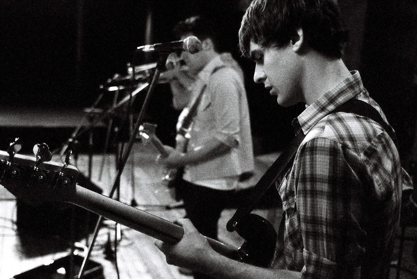
The main aim of the afternoon was to get shots of the band playing together, and photos like this one, with all the mics in a row, hint at the scale of the band while still focusing on an individual.

The great thing about being in the rehearsal room with Eagle and the Worm was that I felt totally comfortable getting right up in their faces, which I needed to do in order for lomo shots like this one to work out. Everyone was overwhelmingly welcoming and accommodating, too, which made all the difference. I wouldn't have the success rate I ended up with if not for the total cooperation of all these lovely people.

I was happy to push myself and my cameras to capture more than one person in the frame. But I have to be honest - the shots I revelled in taking were the lone portraits, which enabled my cameras to really get to know everyone, so to speak. Initially, I did this while they played. And take a look at these four stunning shots of the solo musicians:


There isn't much to say about these that you can't tell just by looking; they're all so vibrant and attractive.

I wanted to take the portrait idea further, though, and so I got each member to pose for me against a grotty old wall after the rehearsal had finished. I shot them on both 35mm and the Diana, and I love the results from each format. Here are just a few examples:


Look at Liam! Look at Jim! At Joe! At Michael! Holy hell, if nothing else you have to concede that this is one good-looking band.

I suspect Jarrad asked me to take the photos because he thought that the style of my black-and-white photography would suit the down-and-dirty, marvellously boisterous vibe of his magnificent band. I think he was right. When he told me he was thrilled with the results I felt completely relieved and abolutely over the moon that my photos could please someone else to such an extent. But aside from that, the almost total success of these photos means that I'm finally at peace with those terrible images from just over a year ago.

11.3.11

drug house?

Isn't that what shoes over the wire is supposed to mean? I quite often see shoes flung over the wires on our street. Either this means that we live in a particularly active narcotics area (quite possible), or we have a lot of bored neighbours with too many shoes.

Either way, I have no complaints. Because the result gives me a regularly shoe-filled view when I crane my neck skywards, which never fails to charm me.

I didn't have high (zing!) hopes for this shot but it actually turned out nicely. I particularly like: the amount of blue sky; the fact that the shoes are so well centred within that blue space; the classic detail on the house directly below; and, most of all, the placement and pattern of the wires across the sky. Why are there so many wires in a quiet residential street?! Wait - I'm asking too many questions again. It doesn't matter whether this quaint house hosts a veritable drug lab or not. It doesn't matter why there are eight wires in such a small space. What matters is that it all came together on a wonderfully clear, sunny day to give me what you see here.