30.6.10

me vs the toilet floor (and a contemplation of change)


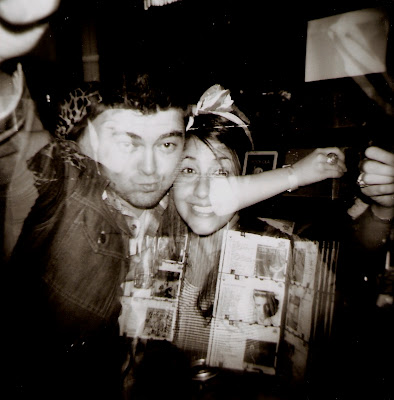
There are two reasons for this photo selection, which I would usually avoid seeing as it's obviously not entirely my composition: I previously alluded to the fact that I would post more toilet floor double exposures and the others are quite unflattering of my friends (who I don't wish to upset); and I am using this entry to convey some of my ideas about where endless bags of dirty laundry is heading, so it's a bit more personal and reflective than usual.

The red flash gives this image a more subtle floor effect than the white flash I have used in the past, which means it isn't as striking as previous attempts, but also means that I show up in both the black and white squares (as opposed to only black). The photo is pretty dynamic, too, thanks in equal parts to my ridiculous expression and the second-exposure photographer Ms Lenton's decision to turn the camera on an angle. Thanks Annie!

But really, there is a more pressing reason for this blog entry. I'd like to spend a little bit of time writing about myself, my ongoing adventures in photography, and also about the blog that you are reading.

OK - a confession. I have strayed from the lomo family. In a big way. I recently purchased a second-hand film SLR and have subsequently spent quite a lot of my photo-taking time with the giant machine that is the Nikon F4. Which is not to say that the Holga has been entirely neglected; I picked up two new rolls today. But it does mean that the plastic-camera output has been and will continue to be reduced.

OK - another confession. I recently acquired an iPhone and have been enthusiastically (and critically) exploring the infinite number of photo applications available. I am shielding my face in anticipation of all the proverbial backlash I am expecting - Not only is it digital, but it's a PHONE camera! I hear you cry. However, so many applications attempt to replicate the plastic camera/analogue aesthetic - some better than others - and I am fascinated by the range of results I can get. I mean, just how good can iPhone photos be? Could you replicate (or even improve) lomo photos? Given the relative costs of both methods it is a question worth considering.

I still love my Holga, but my photography interests have expanded. I want to document them, and I want to record my ongoing exploration in a public forum. The obvious question is, Can or should I post non-lomo photos on this blog? It's a tough one to answer, because I can think of very good reasons on both sides. For example, the idea of breaking the beautiful square-photo layout of the blog is a bit devastating for a pedant like me. On the other hand, if I started a new blog for my SLR (and even a few iPhoto) images, I wouldn't be able to update either blog as regularly as I'd like.

To be honest, I'm leaning towards morphing endless bags of dirty laundry into a multi-format photo blog. But I want to know what you think. Do you strongly oppose? Support? Do you even care?

Please, tell me, whoever you are. I care more than you think.
15.6.10

don't you think?


The ironic photo is often as cringe-inducing as the song this blog post takes its title from, which is why I don't often attempt to capture irony through the lens. But on my visit to Bondi, I couldn't resist! At the risk of sounding like I belong on a certain other Sydney beach, this image is just so Australian.

No wonder Bondi Rescue never runs out of material.

1.6.10

la paloma


Reason #1 this photo is flawed: there is light leaking in from the right hand side.


I know what you're thinking - Just photoshop it out! But let it be known that all the photos on this blog are unadultered, except to reduce the excess brightness that my cheap scanner introduces. The light isn't that bad. Just distracting.

Reason #2 this photo is flawed: the subject lacks definition.

Perhaps it would be nice if we could see his face a little better.

Reason #1 this photo is beautiful: the fabulous typography. Backwards.

Isn't that typography just a dream? Classic and superb. Its inversion makes it that much more interesting to look at.

Reason #2 this photo is beautiful: the wonderfully decrepit paint on the outer wall.

Every aspect of the cafe's exterior design recalls images of traditional (European?) towns and buildings. The great thing about the wall is that it is actually just old and peeling, rather than made to look old and peeling. It feels very authentic.

Reason #3 this photo is beautiful: taka. Looking unsettlingly calm.

Why is he just standing there? Even though I know the answer to this (which is: I asked him to), looking at him in here makes me question it every time. I don't know how he manages to look so completely disinterested in the act of being photographed, but he does it brilliantly. This makes him the perfect subject because he is wholly unfazed by the prospect of being observed - by me/the camera or by any passers-by.

Reason #1 La Paloma is worthy of documentation: its charming, understated aesthetic.

See above.

Reason #2 La Paloma is worthy of documentation: it's on my street.

And my street's great.

Reason #3 La Paloma is worthy of documentation: CHURROS.

Hands down, the absolute best churros I have ever tasted. None of this chocolate dip business, either - the long piped donuts are fried to perfection and smeared with a generous helping of rich, super-sweet condensed-milk-style caramel. Then covered in sugar. You'll never set foot in those blasphemous San Churro brothels again.

25.5.10

ghost kids


It's fair to say that ghostly images of little ones are traditionally kind of creepy. I'm mainly thinking of horror films - you know, The Shining, The Others, The Orphanage. But I've taken a few 'ghost' (i.e. double exposure) shots of kids and I've never had that result. I don't specifically aim for eerie shots, but I'm surprised they never come out that way. Kids are supposed to be pure and good and innocent and protected, which is presumably why the image of a ghost (read: dead) child is usually a particularly sinister or tragic one.

Alas, the ghost kids I've got are quite beautiful, and not in a scary way. Take the above - it's bright and colourful, it's at the beach, she's wearing a sun hat, everyone's having a great time! (Not even the over-exposed white gives her an otherworldly presence!) Am I wrong? Is there some kind of Sixth Sense vibe that I'm missing?


Even in the old-fashioned black and white the ghost child fails to elicit chills. She's just so happy! (Incidentally, this double exposure was unintentional, and I would have loved to see the other image on its own - the one of her with her head resting on her shoulder. It probably would have been a lot more mysterious, too!) It's not that I don't like these photos, it's just that they're more Casper than Ringu, which is at odds with conventional images of ectoplasmic infants in the creative media.

Well that's it from me today - all this talk of ectoplasm has reminded me of the sheer awesomeness of The Frighteners and I'm off to YouTube that shit.

17.5.10

people vs walls, pt 3


Looking over the scores of photos I've taken since receiving my Holga in late 2008, double-exposure portraits involving the colour flash and patterned walls stand out as being among the most successful. It's a formula I return to often precisely because the results are almost always exciting. There are a few rules I stick to in order to maximise my success rate:

1 - Use a dark colour flash for the walls (red or blue is my standard). This way you reduce the risk of losing your human subjects in the bright wall patterns.
2 - Choose a pattern that has at least some dark elements. If your wall is mostly light-coloured, those parts will be highly exposed and your faces won't show through them.
3 - Get close to your portraitees and use a white or a yellow flash. This will ensure that
a) there is enough light to capture them (being too far away with any flash is a disaster, as I have previously demonstrated), and
b) the thematic focus of the image is the portrait, while the darker-coloured wall patterns provide the figurative background.

The above photo demostrates all of these rules in action. And what a lovely photo it is! - no doubt enhanced by the gleeful smiles on my subjects' drunken faces.

While I stand by the relative reliability of the above rules, it would be short-sighted and boring of me never to challenge them. One of my most common departures from these guidelines is the employment of surfaces other than actual walls. This one was from the embroidered velvet head of a motel bed (deliciously sleazy!):


Also an excellent demonstration of the downside/upside of the white elements in patterns.

Other times, I don't alternate the colours at all. Here's an interesting one, not only due to the muted colour but also because it's not just an abstract pattern - it's very obviously a toilet floor:


But it still works. So, you see, breaking rules can be beneficial!!

Coming up: (more) people vs toilet floors. Plus! people vs their jumpers.

28.4.10

smile!


Maybe the most common type of photo that people take is the "Hey guys! Smile!" photo, which I think could just as validly be called the facebook photo. Sometimes it's in front of a national landmark, sometimes it's with a reluctantly obliging quasi-celebrity, sometimes it includes the photographer as well as the photographer's outstretched arm. Everybody has them, and more often than not they contain a combination of bad lighting, ordinary composition, awkward facial expressions and severe red-eye-itis. Why do people insist on continually taking such unappealing photos? Three reasons: 1 - so they can tag their friends; 2 - while the images may be aesthetically unappealing, they are often treasured for the memories they capture (and besides, a lot of people aren't afflicted with the photo snobbery that I have just displayed); and 3 - occasionally, the "Hey guys! Smile!" photo avoids all the usual traps and turns out brilliantly.

I'm the first to admit that I, too, am partial to this particular type of photo for all of the reasons listed above. When my digital point-and-shoot was still around, its primary role was to click and capture after a "Hey guys! Smile" was gratuitously yelled across a room. I've also taken a lot of these photos on my lomos, usually while socialising (and often inebriated), with varying degrees of success.

On the highly successful end of the scale sits the above image, a wonderful example of a basic photo that just works. How do I love thee? Let me count the ways:

1 - It's in focus
2 - It's well lit (for a Holga flash photo) - the flash has illuminated both subjects without taking away shading
3 - The background is interesting without being overbearing
4 - The dark hair + dark jacket against the light hair + light shirt creates a lovely contrast
5 - It contains two beautifully natural (and naturally beautiful) smiles - a difficult thing to capture in a posed photo
6 - The glasses are reflection-free
7 - OK, the personal reason - this contains two lovely ladies, Min and Kate. Friends to me, but more significantly, extraordinarily good friends to one another.

This last reason was the motivation for taking the shot at all - Kate was visiting briefly from Canada and was revelling in the opportunity to spend time with her family and friends. But I also knew that she and Min were rapturously anticipating their reunion in the lead-up to Kate's visit, so I thought it would be nice to get the two of them in a shot together. And, in addition to all of the technical successes of the photo, it succeeds because I think it conveys a feeling. I mean, don't they just look so genuinely happy to be there next to one another?

Oh, and just to prove that I'm not claiming immunity to the bad "Hey guys! Smile!" shot, feast your eyes on this number:


OK, now go back to the one of Min and Kate.

22.4.10

browntowning


There's this band in Melbourne that seems to be playing everywhere at the moment. The Tote (just before it announced its closure), The Birmingham, The Espy, Cherry, Rats, The Worker's Club, Pony - plus MySpace tells me there are upcoming support gigs for Dan Kelly and The Gin Club on the calendar. As far as I can tell, there are two reasons this band is gigging so much: 1 - This is an incredible band. Truly, amazing. 2 - Browntown is just such a good guy.

Eagle and the Worm is the combination of a motley bunch of musicians who, to my untrained ears, are damn good at what they do and, to my untrained eyes, have a brilliant time doing it. What they are doing, exactly, is largely dictated by the quiet genius of Browntown, or Jarrad Brown - the bespectacled man behind the band that seems to have become local music's new darling. There he is, above, on stage at The Tote in his green All Stars the night Eagle and the Worm debuted as a live band.

I met Jarrad about a year ago and he's one of the nicest and most unaffected musicians I have met. I reckon most other people who have met him would probably think the same thing, and maybe that explains why venues are so enthusiastic about hosting his band. I mean, who could say no to this face:


Moreover, the parts of Jarrad's personality that I have witnessed shine through brilliantly in his music - overwhelmingly positive, chilled out, a little bit psychadelic - in his own words, good times. Maybe that's why venues are so enthusiastic about hosting his band.

So when Jarrad asked me to take photos of his new band at The Tote, I instantly obliged even though I hadn't done such specific projects before and my cameras are notoriously unreliable. The gig was packed but for whatever reason people stayed away from the front of the stage. Which meant I had to shoot in full view of the entire audience. Which, on a school night with very little alcohol, meant I was pretty damn nervous. But I swallowed the nerves and persisted, shooting a couple of rolls on colour and black and white.

When the photos came back I was bitterly disappointed. Not because they were awful, but because they weren't what I wanted. They were (are) too dark, too vague, too ordinary. It took a long time to choose a photo to include here, but in the end I went with the one that showed Jarrad most clearly (which should give you an idea of the overall lack of clarity in the results). I could never really articulate the overarching thing that bugged me about these photos. But now I get it. After writing what I have just written, it seems so obvious. The photos just didn't do justice to, or fit, the music - or the bloke behind it all.

So here it is, my (semi-)public admission that I took some bad photos... when someone specifically asked me to take good photos. I cracked under pressure and let my discomfort get the better of me. (Jarrad being Jarrad, he maintained that he liked them and was ever grateful.) In order to wash the acrid taste of disappointment from my mouth, the best thing to do is to stand up, move on and write the whole thing off as a learning experience. And above all the other lessons I could take from this - and there are many - maybe the most poignant is to just relax and do what you love. If you're anything like Browntown, the results will not disappoint.

15.4.10

little bourke street


After some recent lomo disappointments and the realisation that I need to take my plastic-camera-photography back to basics, I challenged myself to finish off a film (four shots) on the walk from the bus depot at Spencer Street Station (Southern Cross, whatever) to Michaels. Suitcase wheeling behind me and Holga rattling against my necklace with each step, I set out on Little Bourke Street looking left, right, up and down for any kind of interesting scene.

The first one I came across involved a lot of writing on a large wall, with frequently placed and evenly spaced lights jutting out above it. What attracted me most to this structure was my surprise at having never seen it before. It's just a part of the city (west of Elizabeth Street) that I don't venture to very often. What attracts me most to this photo is the angle and the lights. What surprises me most about this photo is that it's evidently a monument to K-Rudd's 'sorry' speech - I was so taken with the aesthetics that I didn't even bother to read the words when I took it!


A bit boring, this one. At the time the sun was creating very sharp shading across the buildings and I thought it might be interesting. But I (once again) forgot that my camera wouldn't capture such fine detail.

At this point I knew I was struggling for a good shot. Two photos left. Two opportunities to get something nice. Or curious. Or surprising. Or blog-worthy.


Again, building + light + sky. This image reveals one of the drawbacks of having a viewfinder that doesn't see exactly what the lens sees - no amount of second-guessing will guarantee a perfect composition. You can see what I was going for... just didn't quite pull it off. Still, I don't think it's awful.

One photo left. Hmm. So far, the subjects haven't really been representative of the variety to be found along the Little Street. So far, it has just been looking up at mostly boring buildings. OK, stop looking up.


Again, kind of boring. Having said that, it is a scene that can be found in or just off most of the CBD's streets and lanes; for every dingy laneway with a dirty-chic bar full of hipsters and colourful (or socially relevant) street art there are a handful of dingy laneways or alleys that are just, well, dingy. Forgotten bluestone, upturned milk crates, ordinary grafitti, discarded club flyers, broken booze bottles - it's part of the city and, more specifically, part of Little Bourke Street.

The very next alley had vibrant, unique grafitti displayed lovingly all over the wall, and I considered shooting it before deciding that the dingy alley was a truer, edgier depiction of the city. Who needs pretty when I have dirty? What do I want with that flashy alley, the kind that would probably end up in some trend-a-rama tourist guide to Melbourne? My alley was hardcore. I had to risk any number of depravities - put myself at the mercy of any number of unsavoury alley-dwelling characters - just walking in there to get the shot. Yeah, I was totally keepin' it real, bitches.

Besides, I had finished my film.

5.4.10

as the winter months approach


When March draws to a close and those crisp autumn nights send Victorians reaching for jumpers and boots, I am usually ready for the cool. The intense heat of the Melbourne summer has traditionally left me craving winter clothes (scarves, gloves, coats) and a winter city (cafes, umbrellas, footy) by the time Easter rolls around. For the first time in many years, however, I find myself lamenting the loss of the balmy nights, the bare legs, the sweat, the heady romance. Maybe it's because my winter wardrobe leaves a bit to be desired. Maybe it's because I prefer cider to coffee. Maybe it's because I'm a Demons supporter.

Or maybe it's because winter means that the above scene - family cricket on a sunny day in a glorious field of ebullient dandelions - is simply not possible.

I know that I will revel in the many shades of winter black I can add to my wardrobe. I know that I will cherish wrapping my hands gently around a Max Brenner hug cup of liquid chocolate on an icy day. And I am sure that I won't care about the cold when, at least a couple of times this season, the siren blows at the MCG and the Dees are up. I know that Melbourne is an incredible winter city. But I also know that right from the beginning, I'll be longing for those magnificent balmy nights.

30.3.10

hungry?

I reckon this burger could fill a pretty decent hole.

The great thing about this shot is that the absence of any explanation or analysis makes it exponentially more interesting and absurd.

(The end.)

24.3.10

people vs walls, pt 2


The combination of a beautiful wall and a beautiful person is a great one. Positioning people in front of striking patterned or textured walls for black and white portraits can yield gorgeous results. But I have discovered that there are other ways to incorporate walls into portraits. For example, instead of positioning the subject in front of the wall, why not place them in the wall?

We were in Koko Black in the city, sitting upstairs by one of the stunning semi-circle windows that looks out over Royal Arcade's classic black and white tiled floor. The room's dark wooden and leather decor radiates a winter comfort, incorporating a lot of irresistable deep brown floral wallpaper. It's elegant, and it's warm. And it matches my mum perfectly - visually and figuratively.

I have taken other photos of people in walls, which have been highly successful for the most part. I may post them another time. But for now this photo stands on its own. For several reasons I feel this is one of the best and most unique images my Holga has produced. And so it is, as it is, as it should be.

16.3.10

colour and shape or: how i learned to stop worrying and love the plastic


While I am still unhappy about the poor standard of my latest rolls, there will be no actual smashing of plastic. Here is one of the (very few) images I got back that I am fond of. It took me a long time to work out what is pictured in the photo, and when I did figure it out I realised that it actually doesn't matter.

I took this because I was at an event and wanted to get some photographic evidence. But there is nothing in this image that can be obviously linked to the event - which leads me to the question, Why only take photos at noteworthy moments? I have taken many photos of ordinary things at ordinary moments in the past, but lately I have only been exercising the cameras during outings of some description - day trips, gigs, visits. And perhaps this is more of the same problem; as I lamented in my last post, these cameras are not always capable of standard photographic fare. I should stop expecting them to be, and instead allow them to capture strange combinations of striking hues and unpredictable patterns such as those displayed above. I have to accept that the cameras operate with a certain level of autonomy.

Possibly, this resurrected philosophy will prevent any future post-Michaels mini-meltdowns. Possibly.

9.3.10

excuse me while i smash some plastic


It is a common belief that a good chef, when faced with a bad dish of her own creation, should never blame her tools. Instead, she should accept responsibility for the mediocre meal and acknowledge that her cooking instruments are merely a practicality; a way to get from egg whites and sugar to meringue. I have always subconsciously subscribed to this belief and its counterparts (carpenters and hammers, musicians and guitars, lawyers and the law), but lately I have been wondering, What if her oven is inherently flawed and consistently inconsistent? Is it really her fault if a temperamental thermostat causes her souffles to fall?

In the past, I have acknowledged that the plastic cameras I use are in fact flawed, and that I must accept their limitations in order to maximise their potential. And I have tried in earnest to work with these limitations, often with significant success. But there are times, like tonight, when I pick up a new roll or two and wonder why the hell I am throwing so much of my money into something that so often disappoints me, despite my best efforts to avoid any obvious lomo traps.

Take the above photo. My lovely family and I spent a picturesque weekend in the Dandenong Ranges, taking in the towering greenery and general peace that pervades the area. This image was supposed to capture the serenity of the surrounds and, more significantly, to get my mum, dad and sister in a shot together. I know Diana has a tendency to cut people's heads off (the discrepancy between the viewfinder's view and that of the lens is significant), so I aimed higher. I knew the shade of the tree would throw the lighting out, so I opened the lens up and used a fill-in flash. Even with this considered approach, though, I ended up with the kind of murky mess you might expect to see come out of a child's first roll of film. What could I have done to avoid this?, I have been asking myself. And the only thing I can come up with is Accept that Diana can't handle shaded mid-shot portraits. What kills me is that I can see just enough to know that this photo would have been gorgeous had it been captured properly.


The detail and texture in this wall - which is made from pieces of doors - looked so beautiful as we sat in an eatery with the afternoon light pouring in through the open shopfront. There's enough light, I thought. Even though it's inside, and the Holga has traditionally done a bad job with natural light inside? Yes, look at the light, it's really bathing the whole scene. Maybe a flash would be good? No, it will ruin the way the natural light falls on the wall. There's definitely enough light.

THERE WASN'T ENOUGH LIGHT. And so much for the texture in the wall. What could I have done to achieve the desired effect? Unfortunately the only answer to this question is Use a better camera.


The scene and the colours were so beautiful, so achingly beautiful, that I put Brodie in the potentially uncomfortable position of moving seats around in public to very obviously pose for me. Slide film will make the blue of the sky sing! The red flower in her hair will be a glorious contrast! The composition will be delicate, subtle, and will capture Brodie exactly as I think she should be! It isn't often that I am so sure of a photo.

I almost cried when I saw this. WHAT THE HELL HAPPENED?! The sky is overexposed. This, I suppose, comes down to bad judgement on my part; I probably had the shutter speed set to "cloudy" instead of "sunny". But I'm quite sure the composition I tried to achieve had the whole flower within the margins. And I have never - never! - experienced blurriness due to camera movement. (I'm almost certain it's not just out of focus because if that were true, the background at least would be in focus.) Is this some awful new trait of Diana's? I mean, just how long did the shutter stay open for?

There is some suspicion in my mind that this is actually an OK-looking photo as it is. But there is no way for me to tell. All I see when I look at this is the perfect image that it should always have been.


I've taken photos of bands at the Birmy before, and they have almost always been successful. There isn't much I can say about this photo that can't be concluded just by looking at the thing. Too dark, too blurry, too bloody awful. Again, some may see something worthwhile in its strange imagery, but all I see is a giant fail.

At times like this, the siren song of the digital camera is never more alluring. The fact that I picked up these photos the very day before my shopping-spree work bonus hits my bank account is probably not a good thing at all.

25.2.10

the floating cafe


Apparently this is a rather famous cafe in Sydney. Or at least, its parent cafe in Woolloomooloo is famous, being a known celebrity-slash-tourist attraction, and also being listed on the National Trust register. It's called Harry's Cafe de Wheels, and its culinary specialty is something called a 'Pie Floater', involving a meat pie, tomato sauce and mushy green pea soup.

But I couldn't care less about the fecal-sounding menu, or how many times Elton John ordered from it in the seventies. To be honest, I never even laid eyes on the 'original' Harry's, nor do I have any great desire to. What I do care about is the lovely little shoebox eatery pictured above, which sits unassumingly at the foot of the grand Capitol Theatre in the (outer?) CBD. As soon as I set eyes on this architetural anomaly I just knew I needed to get a picture. Its irresistable typography and romantically sweeping asymmetrical roof cry out to be celebrated and commemorated on film.

Beyond my admiration of its mid-twentieth-century Americana aesthetic (no doubt related to my unabashed love of carny chic) is my joyous surprise at discovering a permanent fixture in the city that is, paradoxically, inherently temporary. I mean, the thing's on wheels! It recalls the Mr Whippy ice cream van that haunts the Arts Centre stretch of Melbourne's St Kilda Road. Unlike the ominous icy-treats van, however, Harry's never goes away.

I don't recall a black and white medium format picture of mine that has ever looked so dreamy. I like to think my camera responded to the otherworldly vision in front of its lens. As one observer remarked upon seeing this image, it looks like it's floating. And I tend to agree - floating in time, floating in space, floating in a city that sometimes seems to be drowning in its own bigness.

I don't know what your Pie Floaters are like Harry, but I really dig your style.

13.2.10

people vs walls


There's nothing I love more, photographically speaking, than a good portrait. When I talk to someone in the same spot for long enough I will invariably consider how they might look on film in that moment. Sometimes the answer is like shit, but sometimes if I have my camera on me I decide that a shot is definitely warranted. When James and a few others were in conversation over dinner in early 2009 I noticed how lovely the seat backing was, and snapped with the hope of capturing that and his beautiful smile. When photographing people - particularly when you're only prepared to chance one shot on them - it is hit and miss as to whether the result will be any good. I think this one was a hit.


This is not necessarily a miss, but I do regret the (lack of) focus and the break in the wallpaper to the left. What is visible of the wallpaper looks great, though, and I think it's a lovely shot of Madeleine. The fact that it was taken on her seventeenth birthday makes it even more momentous.

I suppose the notion of a busy background in a portrait seems like it might detract from the subject, which I have no doubt is a common occurrence. Perhaps the reason I don't find that in these shots is because they are black and white, so the backgrounds are only as busy as their patterns, rather than colours. (The graffiti shot of Laird is another great people vs wall shot - in this case the background actually complements the portrait as it's one of Laird's favourite, and most frequented, alleys in Melbourne.)


I have only made one attempt at these shots in colour, and I love it - but I don't think it's necessarily successful as a portrait. The combination of the surreal colour and the black-as-night sunglasses dehumanises it, so while the image is aesthetically pleasing, it doesn't reveal much about the subject.


I was immediately disappointed with taka's eyes being closed when I got this back, following my logic that eyes are a crucial element of a good portrait. Then I looked at it a bit more, and within a few hours I was in love with this image. The photo collage makes for a fabulously unusual background, and the bright flash around his head combined with the vignetting around the trim gives the shot a great sense of depth. It's hard to put my finger on the reason I grew to appreciate the closed eyes - perhaps because it doesn't necessarily look like it's a blink (though it was), so there are an infinite number of conclusions that can be drawn. Is he deep in thought? Is he rejecting the photographer's request to take his picture? Is he upset? Or resting? Or listening to something? What? It seems that closed eyes can prompt as many questions as open eyes.

Analysis aside, another reason this is a treasured image is because it captures a common weekend occurrence: 2am, Brunswick Street, pizza slices. Taka is drunk and sleepy, and he happens to be standing in front of a great looking wall. And maybe it's as simple as that.

31.1.10

ode to the most beautiful place in melbourne


The past two weeks has seen an outpouring of unabashed emotion from Melbourne, Victoria and Australia in response to The Tote Hotel’s closure. Musicians who over the decades have graced the stages, fans whose live-music cherries were popped at the corner of Johnston and Wellington, those that have never visited the place but who actively fight to retain our city’s rich musical culture: these are just some of the many sectors of society that stood up and said no to the outrageous late-night venue restrictions, and more specifically to the demise of this beloved venue.


And then there are those of us that just loved to be there. To the people that frequented The Tote, its potential closure meant more than the loss of a great live venue, more than another nail in the culture coffin – though it was those things, too. But this was personal. It meant that we no longer had that place – the place where it didn’t matter what you looked like, the place where the love of music and a drink was enough to unite even the most disparate patrons, the place where people knew your name and you knew theirs, the place where you felt safe, the place that felt like home.


There is much talk that The Tote may reopen, which is brilliant evidence that when people stand up for what they love, the government is forced to listen. But that fact also threatens to make Tote memorials (such as this) somewhat redundant. After much thought, though, I have concluded that regardless of what happens, this is simply a celebration of The Tote as I knew it.


All the things I loved about The Tote were present at the phenomenal "Last Drinks" gig held on an otherwise unremarkable Monday night in January. If you too knew and loved the place then I’m sure these images will ring bells, and I have no doubt you have countless other memories that aren’t captured here. If you didn’t know The Tote very well, I hope this is enough to convince you to check it out should the doors reopen, or perhaps just to remember not to take your own local for granted.

Because The Tote was as ugly as sin, but like any great local pub, within its walls there was just so much beauty.

***

the music

Some of the best nights at The Tote included the unplanned attendance at either stage watching music as yet unknown to me. This was how I came across excellent bands such as The Toot Toot Toots and, most memorably, Vampillia, whose tiny body-painted performance-artist frontman being violently pushed off the stage by the much bigger suit-clad head-shaving co-singer blew my slightly drunk mind one quiet Sunday evening.

There were over two dozen bands playing during the Last Drinks gig but I only got photos of Digger and the Pussycats, largely because I just couldn’t get close enough to any of the other acts. I’m so glad I got this shot, though. Each time I have seen Digger and the Pussycats play I have grinned uncontrollably watching Andy smashing the lone drum like some kind of wild-eyed lunatic. Above is exactly what he looks like.

***

the jukebox

The music machine that sat humbly in the front bar was known far and wide for its excellent selection. More often than not the metalheads would take over and we would all be subjected to hours of double-bass drums and monotone screaming – but that’s OK, because it contributed to the front bar's character. Sometimes, though, if we waited long enough we would rejoice at the sound of our own selections. From Andrew WK’s “Party Hard” to Blondie’s “Hanging on the Telephone” to anything by The Boss, dancing around the pool table between one and three a.m. was a regular occurrence.

I didn’t intend for this shot to be a double exposure; I simply neglected to wind on the film. I quite like the result, though, which includes the gleeful faces of Billy and Vanessa – two of the many Tote faces I know so well, but whom I don’t really know at all. Billy reiterated this phenomenon that night, exclaiming that he had never had as many Facebook friend requests as he’d received in the week since the pub announced its closure – because, according to him, “otherwise we’ll just never see eachother”.

***

the footy team

An example of the pub’s community reaching well beyond its building is the motley bunch of rejects that made up the 2009 Tote Football team, four of which are pictured above. They were largely unfit and most of them had trouble kicking a ball straight, but somehow they managed to beat Old Bar, Bar Open and The East Brunswick Club to take out the 2009 Pub Footy flag.

***

this guy

And how did they do it? With the help of this guy, the coach, whose half-time addresses (which on one occasion consisted of nothing more than “just keep doing what you’re doing”) apparently inspired the team to victory. Or maybe they were just inspired by the fact that their coach turned up to the matches in vintage suits and smoked cigars during play.

***

tony

When I went to The Tote for the first time Tony scared the shit out of me. The massive, heavily tattooed security guard was a fixture at the pub for as long as I was a patron, and his devotion to his job was solid right to the end: while I waited in line to get in on the Sunday of the protest, Tony swiftly hurled a drunken woman out onto the street because she allegedly lit up in the Cobra Bar. In response to her slurred shouts of protest the always-professional Tony dismissively retorted “Shut your fucken pie-hole and go home!”. Yeah, at first, Tony seemed really mean.


But actually, he’s a big softie. And he always looked after us and made us feel welcome and safe.

***

the cobra bar

The Cobra Bar was kind of like an old exploitation film – small, dirty and sometimes forgotten about, but filled with unexpected gems. Like The Breadmakers, an excellently fun Melbourne band with the power to make people dance like maniacs. Like Eddy Current frontman Brendan Suppression dancing like a maniac to an excellently fun Melbourne band.


Like Marieke Hardy loitering in the filthy ladies toilets, at various stages of the evening participating in a media interview, charging her phone and looking for her money between the pages of a book.

***

the décor

Yeah, of course there was the sticky carpet, but there was also the Attack from Mars pinball machine that I loved but never once played, the gig posters and photos that adorned every inch of the walls, the lightshades that looked just like the ones my mum used to have in our dining room, and the totally random objects that hung from the front bar ceiling, including a naked baby doll with a safety pin through its ballsack.

***

the punks

As much a part of the décor as the baby with a safety pin through its ballsack, the punks could be found checking out bands or having a drink in the front bar on any given night. They appeared to be the real deal – totally devoted to the music, mean-looking but friendly as hell, literally wearing their hearts on their sleeves.

***

the bar staff

The percentage of attractive staff members at The Tote was so high that one night my friends and I were inspired to pen an imaginary song (by our phenomenal imaginary all-girl rock band) in their honour, entitled “I Like the Way You Pull It”.


There’s Tom, whose sweet eyes and charming smile have no doubt left a trail of broken hearts across Collingwood and beyond.


There’s Lachlan, whose perfect features and impeccable mod style turned the heads of girls and boys alike night after drunken night, and whose healthy air of arrogance is sure to send teenage girls into a frenzy as he leads his band over stages around Melbourne.

Honourable mentions to Lachlan’s sweeter but equally appealing tattooed partner-in-crime Curtis, and to the smokin’ hot ladies of The Tote, whose faces unfortunately eluded my lens.


There’s Marty, whose face is not as familiar to me as some others, but who captivated me in the moment pictured above as he belted whichever track was blasting from the jukebox speakers in The Tote’s final hour of business. Because that’s the endearing thing about the staff: aside from being lovely to look at, it always seemed like they enjoyed being there as much as we did.

***

family

Finally, to the people who introduced me to the place, who spent all those nights and all that money with me, and who loved it as much as I did for all the things listed above and more. Laird, Rusty and Shasta, and all the others who don’t happen to be in this shot – we’ll find other places to drink, dance and love. But there’ll never be anything quite like The Tote.


21.1.10

die! die! die! on the birmingham floor


Following the devastating closure of the temple of rock'n'roll, I, like countless other Melbourne music lovers, have been repeatedly asking myself Where the hell will we go now? But I've been thinking, and while the Tote's demise is undoubtedly tragic (more on that in the next week or so), Melbourne does have several other spectacularly worthy music venues.

I have written about The Birmingham before, where I also mentioned the secret Ground Components gig I was lucky enough to attend early last year. It was hot. It was sweaty. It was cramped. It was incredible. The tiny band room can be offputting to the uninitiated, but the intimacy between the bands and the crowd (the stage is about five inches off the ground) combined with the general claustrophobia induced by the proximity of the walls to one another creates a wonderfully communal music experience - which is the great thing about so many of Melbourne's small music venues (The Old Bar, Bar Open and the John Curtin also come to mind). At various stages during the overwhelmingly energetic set, fans were screaming the lyrics back at Joey so hard and so close that it was more a constant duet between Ground Components and their worshippers than something to be objectively observed.

The above photo, which captures the characteristically intense frontman and the equally enthusiastic crowd, could have been taken during any one of their songs, and to be honest, I can't remember which. But I like to think that the shutter may have opened in the middle of this rousing chorus:

They said I wasn't meant for this
A life that can't and won't be missed

So go ahead and blow a kiss

To a life that keeps my hands down by my side


The frenetic crowd isn't visible in this shot, which renders it slightly vacant, or somehow lacking. I'm also suspicious of the mic stand threatening to obscure the subject's face. I still adore the image, though; it absolutely recalls the energy of the room, if only because the impassioned scream erupting from the bass player is obviously spur-of-the-moment genuine - that is, he's not doing it for any kind of musical benefit because he doesn't have a mic. He's totally lost in the moment, just like everyone else in that sonic sauna.

Sweaty strangers crammed into a pub's dirty back room, collectively and euphorically belting out lyrics as a few blokes on a crappy stage spew gut-wrenching rock'n'roll into every crevice: This is Melbourne music, and you can still find it thriving throughout the city every Friday, Saturday, Tuesday night. You just have to look. And listen. And scream.